.svg)
Solutions
Features
Resources
Trusted by 2,000+ operators
"Whether you have a smaller listing count or a larger one, Uplisting is easy to use, and it's scalable."
Josh Kristoff
Nomad Capital Adventures

4.8/5

4.9/5
Log in to your account
"Whether you have a smaller listing count or a larger one, Uplisting is easy to use, and it's scalable."
Josh Kristoff
Nomad Capital Adventures
Log in to your account

Airbnb signs for guests set clear expectations from the moment they arrive, reducing confusion and repeat questions.
Strategically placed signage helps prevent damage, enforce house rules, and improve operational efficiency.
Professional, well-designed signs enhance the guest experience and contribute to stronger reviews.
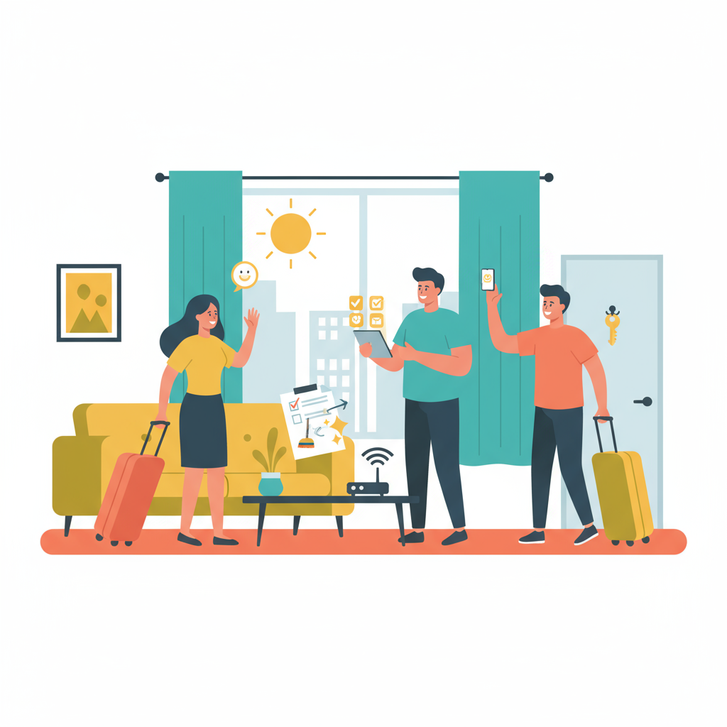
Running a short-term rental (STR) means juggling dozens of small but critical tasks each day: some you can automate, others you can't.
One of the most overlooked tools that saves time and improves guest experience is clear, well-placed signage. Without it, you're stuck fielding the same questions, dealing with small damages that add up, or trying to enforce house rules after the fact.
Signs do the heavy lifting for you. They reinforce your expectations without needing another message. A simple Airbnb house rules sign by the door or a labeled light switch can prevent issues that cost time and money. Done right, they also make your space feel more polished, helping you earn better reviews without extra effort.
In this guide, we’ll break down the dos and don’ts, what to include in your Airbnb guest information template, Airbnb welcome sign ideas that actually work, and how to stay practical without overdoing it.
In the vacation rental world, signs act as silent staff.
They guide guests through your space, answer common questions, and lay out expectations upfront. This reduces friction and keeps your operations running smoothly.
A clear Airbnb house rules sign at the entrance reminds guests what’s expected—quiet hours, no smoking, checkout time—without needing follow-up messages. Signs also help minimize property damage. A laminated note near the washer explaining how to use it correctly can prevent costly repairs. Labels on light switches or thermostats curb misuse and confusion, especially in properties with smart devices or unique layouts.
Design also plays a role. Well-designed signs show guests that you care about the space and their experience. A sleek Airbnb welcome sign at the entrance or a tidy Airbnb guest booklet on the coffee table makes your property feel more professional. This attention to detail builds trust and often leads to stronger reviews. For a starter operator, that kind of consistency matters. It’s a low-cost, high-impact way to keep things running without more manual work.
With a reliable VRM solution you can trust, Uplisting can help you grow your business without wasting time on double bookings, unhappy guests, upset clients and worrying what could go wrong next.
Clear indoor signs reduce questions, prevent accidents, and keep your space running smoothly without extra back-and-forth. Instead of relying on memory or inbox searches, guests get simple, visible reminders that guide them through the stay.
Guests almost always ask for the Wi-Fi details.
Avoid late-night messages by placing network info somewhere obvious, like framed near the entry or printed on a small display by the TV. Skip the router tape or a faded sticky note under a lamp.
Keep the sign clean and readable. If you change the password between stays, use a dry-erase section on a laminated card so updates take seconds, not a reprint.
Most guests won’t remember what you wrote in the listing. Reinforce key expectations with a clear, respectful sign near the front door or in the living room. Tone matters. A sign that feels like a lecture will get ignored.
Try something like:
Quiet hours: 10 PM to 8 AM
No smoking indoors
Only registered guests and please no extra visitors
Short, calm, and clear works. You’re running a business, not a dorm.
Plumbing issues often start with small missteps. If the property uses a septic system or has sensitive pipes, make that known. One simple sign near the toilet or inside a cabinet can prevent a backup.
Mention what not to flush: wipes, hygiene products, cotton balls. Keep the tone neutral, avoiding bold fonts or warning signs. A one-line reminder is enough to steer guests in the right direction.
Guests won’t scroll through old messages on the morning they leave. A short checklist in a high-traffic spot (on the fridge, front door, or welcome binder) makes check-out painless for everyone.
Include basics like:
Strip beds and leave sheets in the hamper
Take trash to the outdoor bins
Lock all doors and windows before leaving
Three to five steps is plenty. Guests won’t feel micromanaged, and your cleaner won’t walk into a mess. Everyone wins.

Signage outside the property gives guests their first real indication that they’ve arrived at the right place. Confusion at the curb leads to unnecessary messages, late check-ins, or worst case scenarios like parking in a neighbor’s spot. A few clear signs placed before guests even reach the door help smooth out the arrival and avoid problems before they start.
A small outdoor welcome sign near the main entrance helps guests feel confident they’re in the right spot. It's both decorative and capable of providing a moment of reassurance. Use the exact name listed on the booking platform, especially if the property has a title like “The Driftwood Loft” or “Lakeside Escape.”
Rather than a tired phrase like “Home Sweet Home,” go with something warm and direct. “Welcome to your stay!” or “Glad you’re here, come on in” keeps the tone friendly and clear. Match the sign’s color, material, and font with the rest of the property’s look so it feels intentional, not like an afterthought.
Parking often trips guests up, especially in shared lots, dense neighborhoods, or multi-unit buildings. Without clear direction, they’ll either guess or message you while sitting in the car. Save the back-and-forth with a weatherproof sign that shows exactly where to park.
Use direct language: “Park in space #2, next to the fence.” For private driveways, ground markers or painted indicators work well. For street parking, include a small sign by the entrance that explains time limits or permit rules, like “2-hour parking from 9 AM–5 PM, Mon–Fri.”
Where homeowners’ associations or local ordinances apply, check for signage restrictions before installing anything outdoors. Some neighborhoods limit visible signs so always confirm what’s allowed. Airbnb signs for guests should make their stay smoother, not land you in a compliance issue.
Automated guest messages keep your guest informed from booking through to check-out. They’re designed to answer questions before they arise, saving you time whilst keeping your guests happy.
Clear Airbnb signs set the tone for the stay.
A well-worded note on the wall can ease friction, reduce questions, and show guests you’ve thought through their stay. On the flip side, a poorly placed or harshly written sign can make the entire space feel cold before the key even hits the lock.
Polite, direct language goes further than warnings in bold. Begin with a welcome where it makes sense. Thank guests for staying. Ask for what’s needed using language that assumes good intent.
Instead of writing, “Do not flush anything except toilet paper,” say, “To keep plumbing running smoothly, please only flush toilet paper.” The second version gets the point across without sounding harsh.
Be as brief as possible. Guests won’t read a paragraph about why the thermostat shouldn’t go below 68 degrees. They will read, “Please keep the temperature above 68°F to prevent system issues.” Clarity beats storytelling.
Too many signs create visual noise. A kitchen filled with notes taped to cabinets feels chaotic, not helpful. Stick to what matters most and place instructions exactly where guests need them.
Group similar messages in one spot. A small framed card on the bathroom counter can cover towel use, makeup removal, and where to drop laundry. That’s cleaner than scattering three separate notes.
Avoid repeating the same reminder in multiple rooms. If the front door sign already mentions quiet hours, don’t add it again in the hallway. One strong message in the right place says enough.
Skip any mention of direct payments. Don’t include QR codes for Venmo, don’t suggest leaving cash, and don’t try to work around the platform. Airbnb takes guest safety seriously, and ignoring that puts your account at risk.
Only post legal information if local laws require it. If the city needs hosts to share short-term rental license numbers or emergency contacts, keep the format simple and easy to find. No need for legal jargon, just the facts in plain language.
Signs should build trust, not raise eyebrows. A guest who sees payment requests taped to the fridge starts wondering what else might feel off. Keep the focus on clarity, comfort, and making their stay smooth from check-in to checkout.
Signs don’t need a big budget or a professional designer to look sharp. Clear, well-placed messages make a property feel intentional. Airbnb signs for guests should feel like part of the space, not a last-minute addition or a forgotten label stuck to a cabinet.
Start with your brand. If each property shares colors, tone, or a layout style, let the signs match. Use the same fonts as the listing description or digital guide. Stick with two or three colors already in the space. The goal isn’t to create a logo wall; it’s to look pulled together without overthinking design.
Mixing fonts, colors, or sign sizes from room to room can make a space feel disconnected. A clean, consistent style keeps the guest experience smooth. When one sign uses serif text and another uses cursive, clarity starts to slip. If bedroom signs are soft neutrals, don’t suddenly jump to bold red in the kitchen.
Use the same type of material throughout. Pairing woodgrain with metal or mixing chalkboard-style signs with acrylic plaques rarely works unless the entire space leans into that contrast. Keep signs simple enough to blend into the room while still standing out when guests need them.
Pre-made sets from online marketplaces often come ready to go with matched styles and common messages. Many Airbnb signage bundles include signs for Wi-Fi, house rules, bathroom use, and checkout instructions. They’re quick to install and easy to update if needed.
For a more personalized look, check out small shops that create custom signage. Many offer tailored designs with your preferred text and colors. Prices range depending on material and size, but the extra polish can help a space stand out, especially in listings where photos drive clicks.
For a lean approach, try DIY templates from Canva or similar tools. Local print shops can laminate or mount signs to make them last longer. Use materials like weather-resistant cardstock or acrylic panels that hold up to cleaning and guest traffic. A clean layout and a sturdy finish keep signs from peeling, fading, or needing constant replacement.
Some of the largest short-term rental operators (with 250+ properties) rely on Uplisting's software to scale their businesses.
Clear, thoughtfully placed Airbnb signs play a vital role in setting expectations, guiding guests, and reducing repetitive communication. From Wi-Fi details to check-out instructions, well-designed signage inside and outside the property helps protect your time, improve the guest experience, and minimize operational headaches. When done right, signs act as a silent extension of your hospitality: professional, respectful, and easy to follow.
Whether you're managing five listings or fifty, consistency and clarity in signage can streamline operations and support your brand. By following best practices for design, tone, and placement, you create a smoother stay for guests and fewer surprises for your team. The result is better reviews, fewer questions, and a more efficient workflow across every property.
Ready to automate more, communicate less, and grow your short-term rental business with confidence? Sign up for Uplisting to streamline your vacation rental management.
Guests look for the Wi-Fi as soon as they walk in, so place the sign where they’ll spot it right away: on the entry table, near the TV, or on the kitchen counter. Avoid hiding it inside a binder or behind picture frames. If guests end up messaging you for the password, the sign isn’t doing its job.
Stick to the must-haves. Combine related notes—like quiet hours, trash instructions, and checkout steps—on one easy-to-read sign. Put signs only where they matter. Nobody wants to read six reminders while brushing their teeth.
Yes, as long as the message feels natural. A quick thank-you and a line like “We’d love your feedback, it really helps us improve!” works well near the door or with the checkout list. Skip anything that sounds pushy or transactional.
Yes, and it’s a smart way to keep communication on-platform. Try something like, “Have a question? The Airbnb app is the fastest way to reach us.” That keeps guests in the loop without sounding like a rule.
Only when it saves a guest from guessing. A drawer marked “Silverware” or a note explaining how to use a smart thermostat can make your setup feel intuitive. No need to label every drawer, just cover the ones that usually cause confusion.
Laminated signs work fine when they’re clean and easy to read. For spots that get messy (like bathrooms or kitchen counters) go with materials that hold up better, like acrylic or wood. Signs that match the space feel more deliberate and less like a last-minute add-on.
.png)